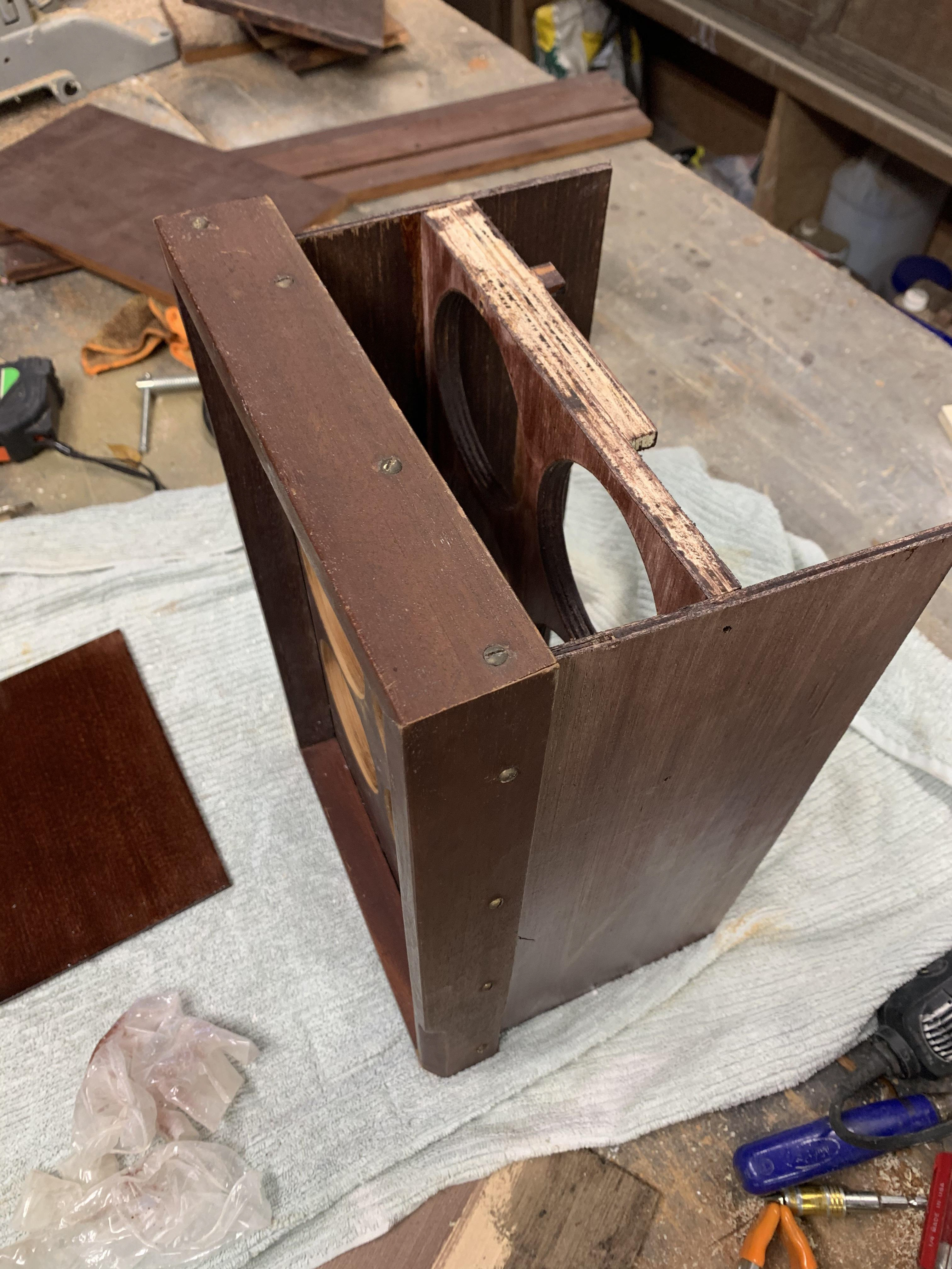
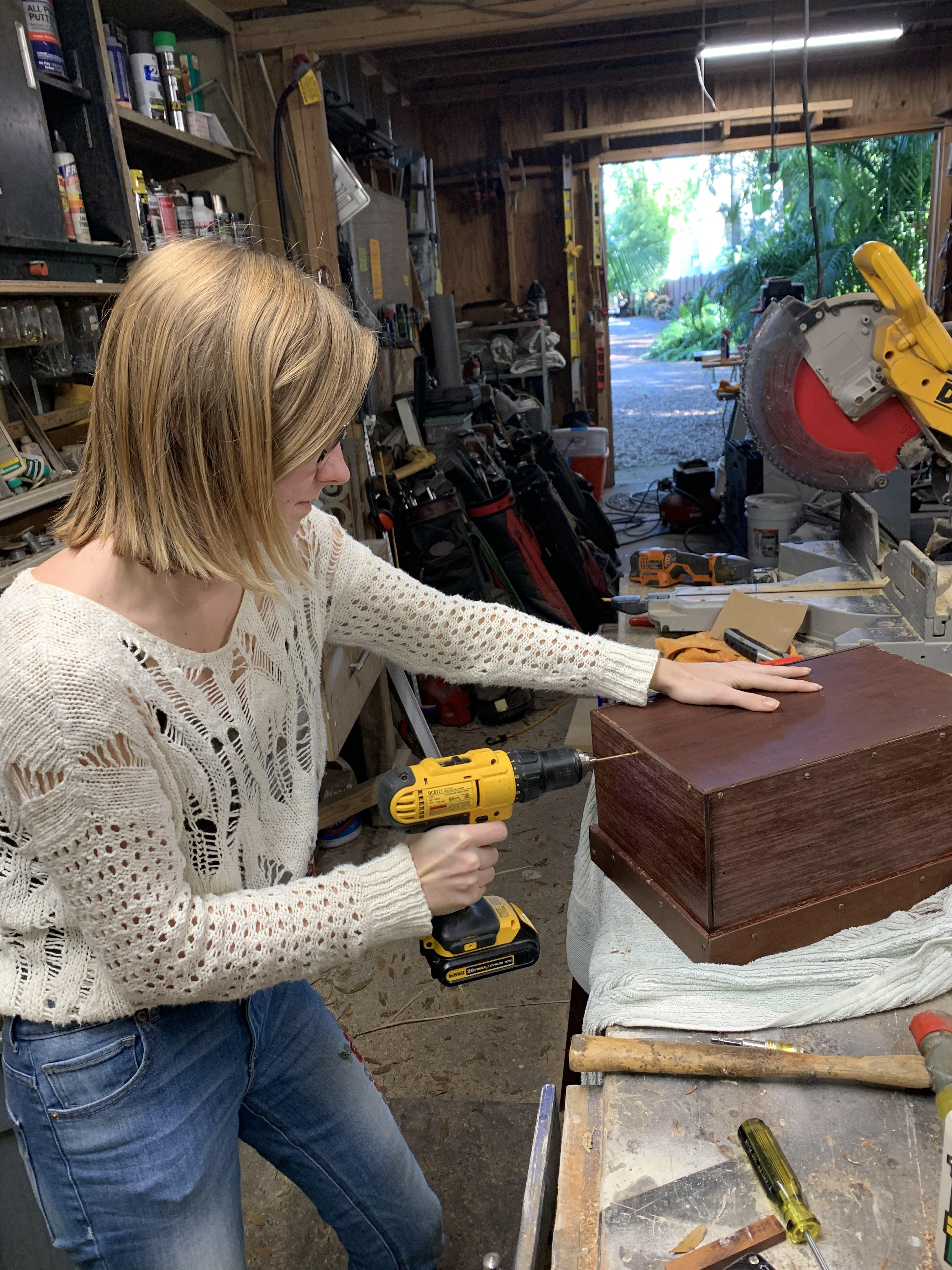
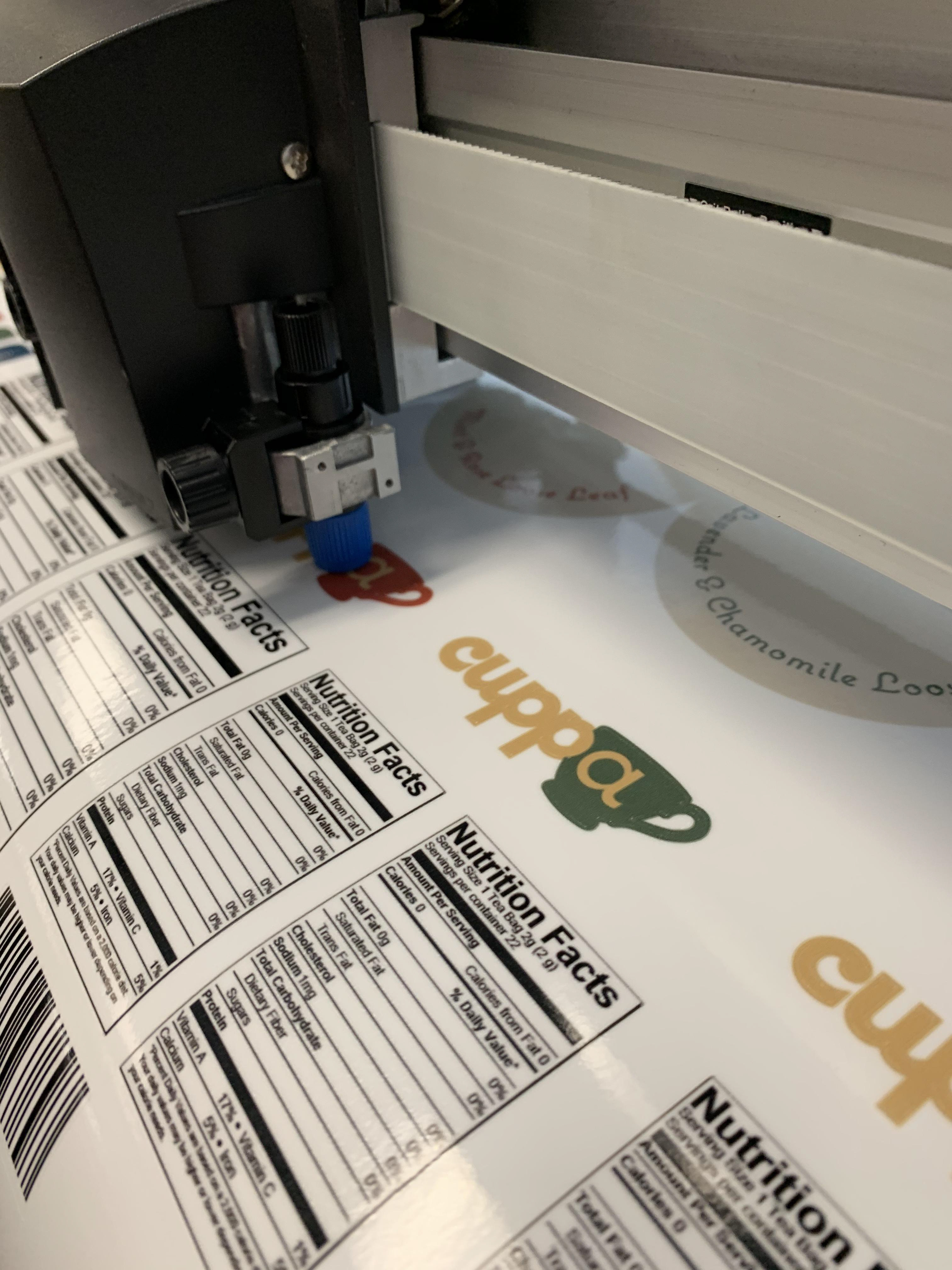
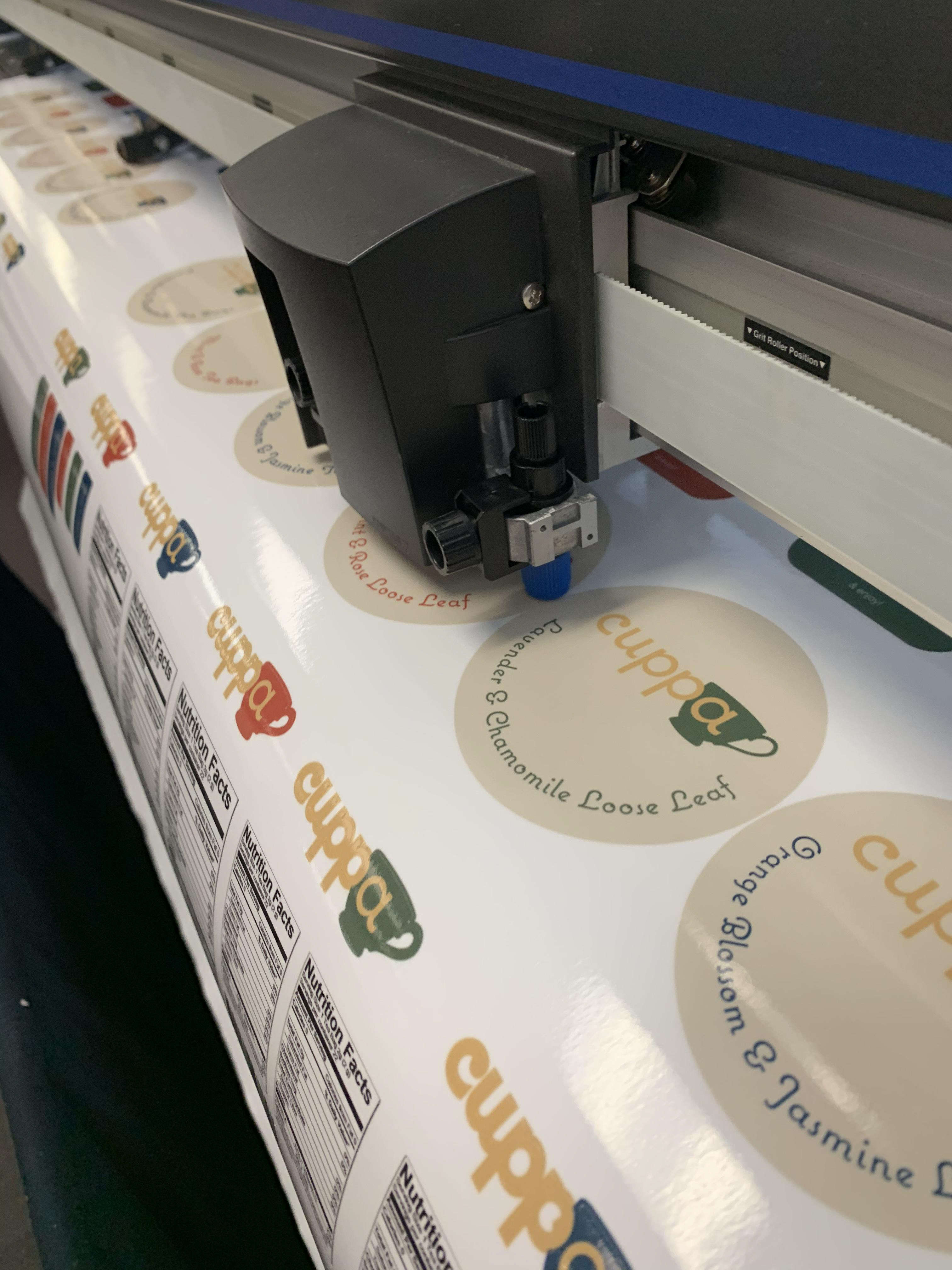
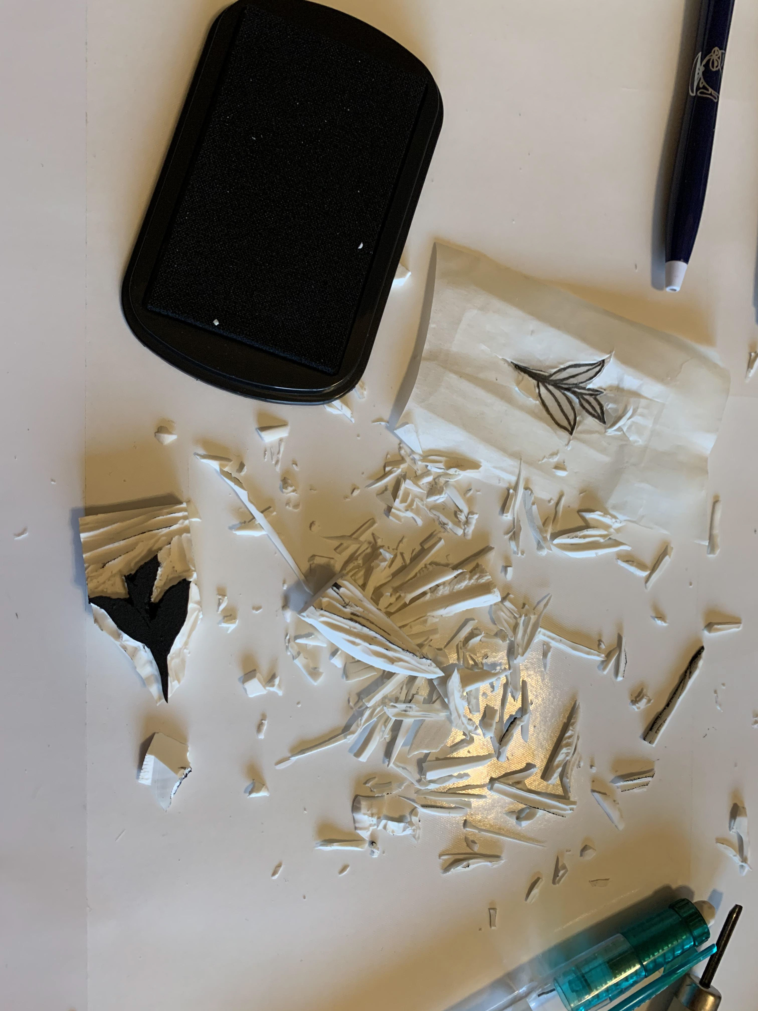
Cuppa was born from my love of tea. It was as I was trying to decide on a which flavor to brew that I noticed tea packaging is so lifeless compared to how wonderful the flavor is. The packaging simply doesn’t do it justice. The outside should reflect the variety of flavors, exotic locations and the life that is bursting from these leaves. That is why Cuppa would stay true to it’s roots and not let stuffy plain competitors like Bigelow set the tea packaging rules.
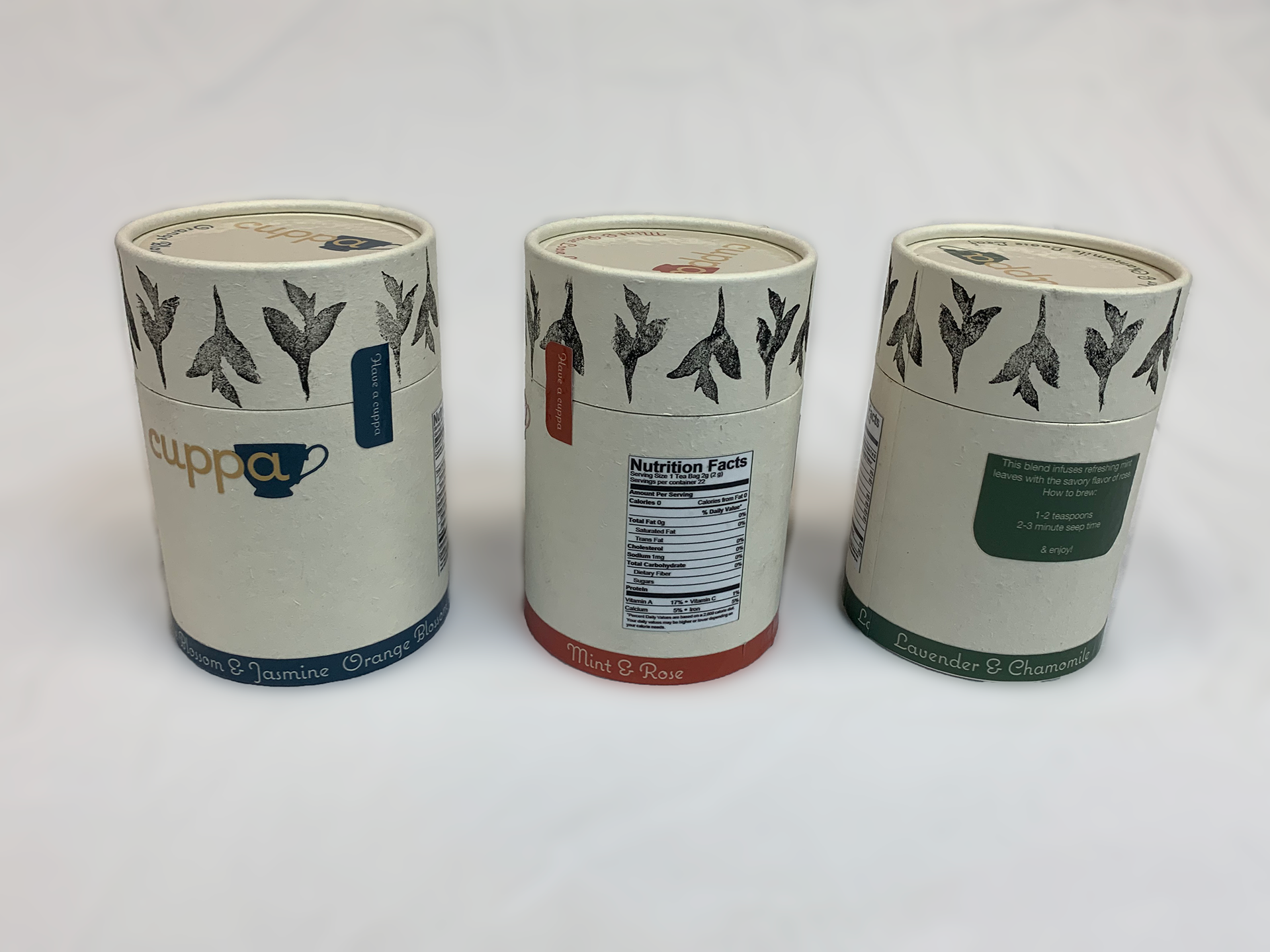
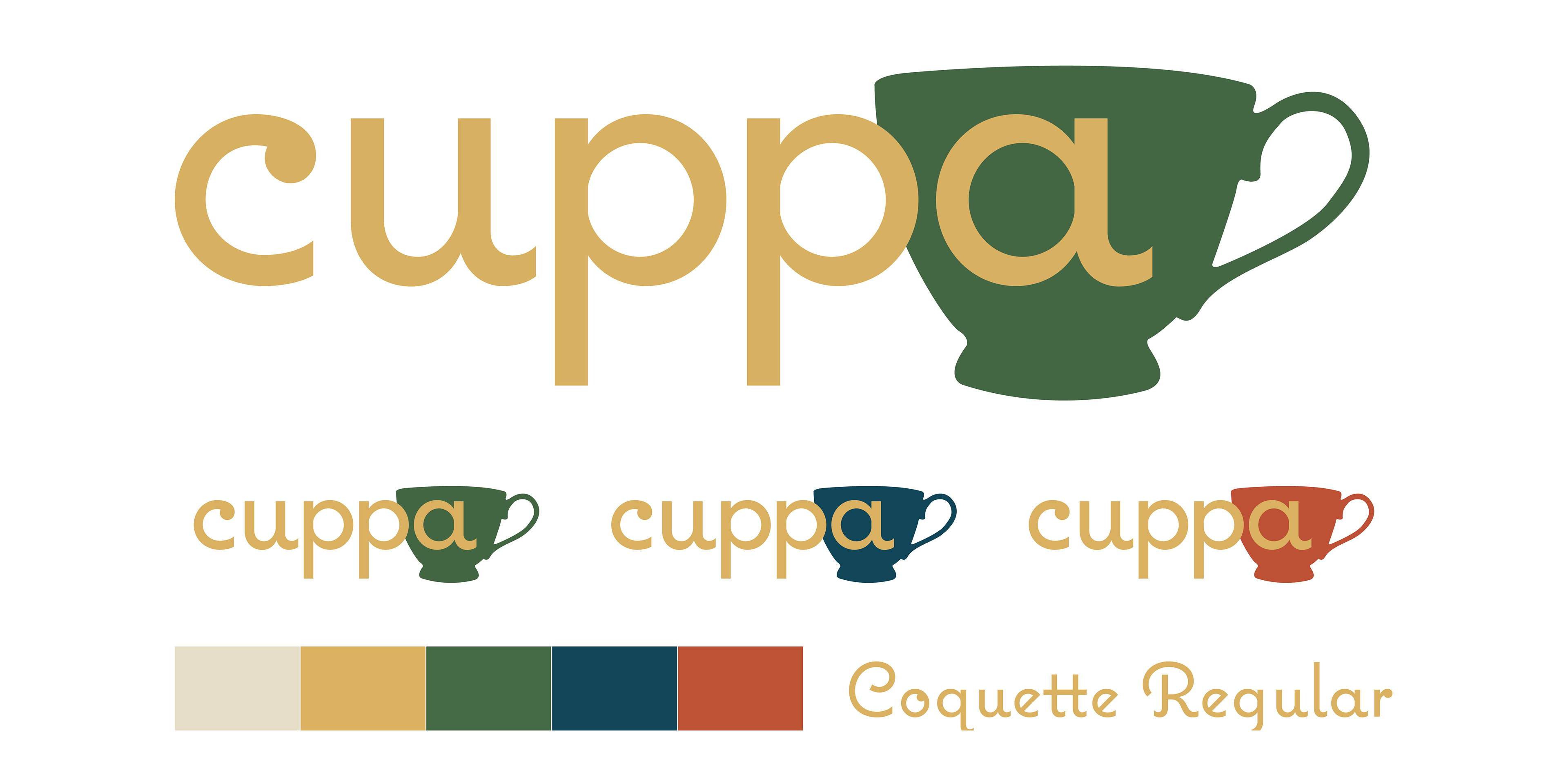
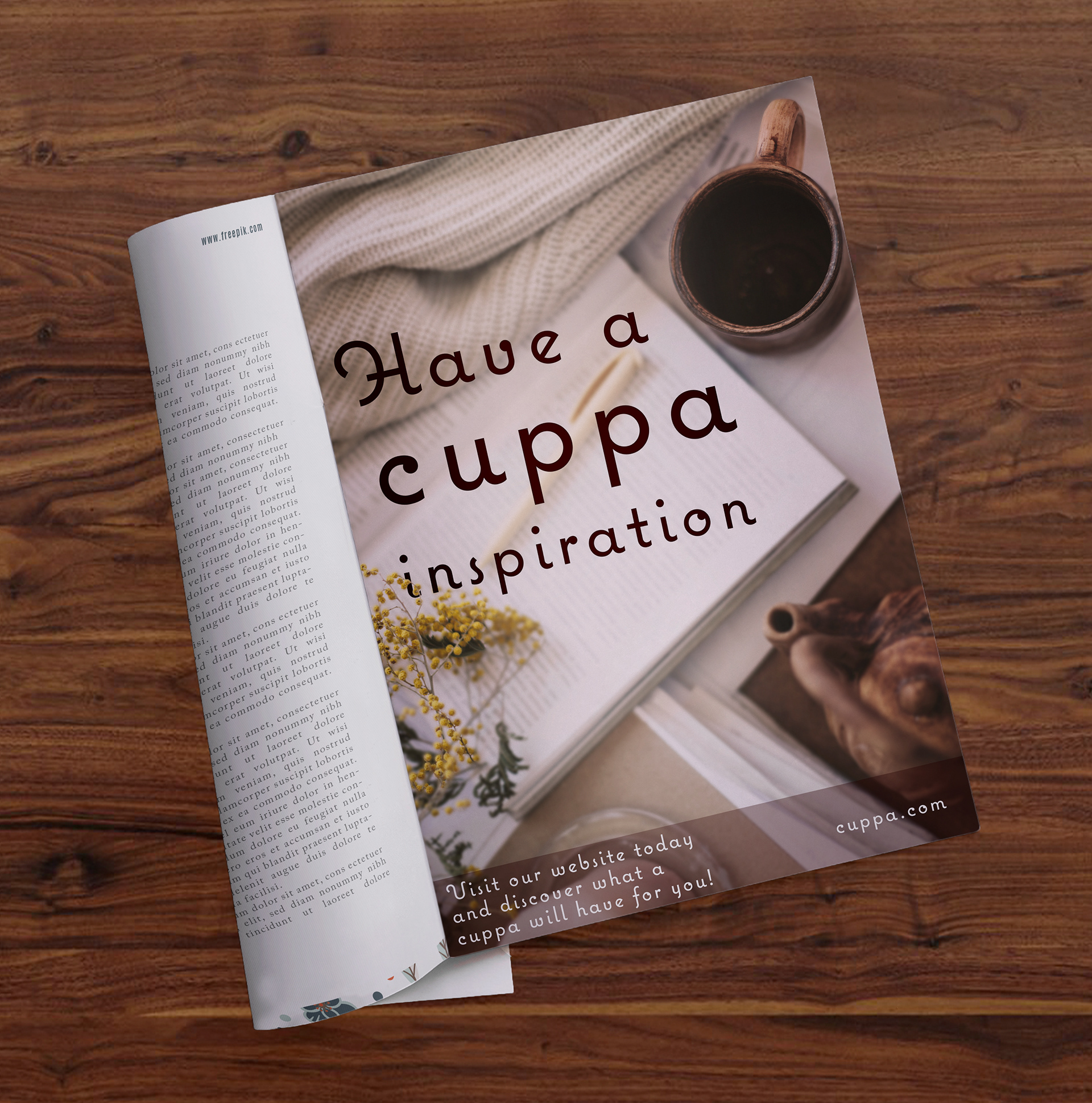


The colors had to reflect tea and stand out from coffee brands. I chose these rich gemstone colors to match the rich falvors released in tea. Finding the colors from gemstones also creates an association of these colors with nature all while enforcing the cozy goal. By matching the deep colors with shades of gold the logo can become responsive and still be recognizable.

